
The difference between your brand and that of others is how it is presented. Shabbily or professionally.
To commend attention, you need invest in the outward appearance of your brand, and how it looks on the Internet.
The great thing about flyer design is that really there aren’t (shouldn’t be at all) any rules as to how to design them. The more creative they are, the better engagement and appeal you can receive from the viewers. (You do need to get the flyer professionally designed, and not done by a friend who just happens to be well versed at Microsoft Word.)
While most flyer designs are cheaply designed, and reflect poorly on the business or the brand that is sharing them, there are a good number of companies who make the right decision of investing in their brand’s products and marketing campaigns. Those companies end up with flyers that you really want to take a moment to see through, to get inspired for your next flyer design project.
01. Using Geometry to your Advantage
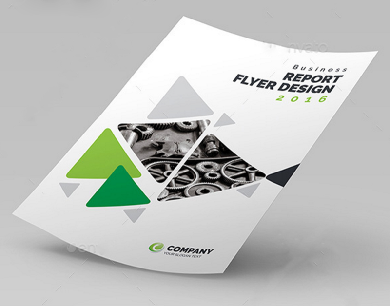
This flyer design features a very smart use of geometrical patterns, with some of the shapes containing images, and others filled with color; all on a clean, white background. Although the shapes could have clogged the design, its minimalist, easy-to-the-eye use resulted in a design fit for a conference seminar promo, or an online marketing flyer.
02. Simple Center of Attention
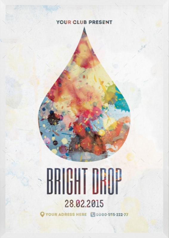
With nothing more than an icon in the shape of a drop of water, the title for the event, and only indispensable info, this design is very set apart from other busy, complex ones out there.
Such designs are typically preferred for single designs or reminder for events.
03. Image Compositions, Strong Concepts
What sets apart this flyer from the bunch is the clean blend of different images into a concept that speaks directly on the information that’s being shared. For this auto show event, there is imagery of the city skylines, dollar bills floating in space, and a vehicle keyed out of its original background. With the bold title of the event, and the key information on the show, this is a splendid example of a composition flyer design.

04. Highlighting a Product
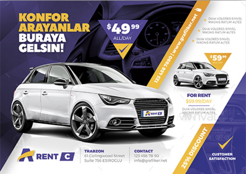
This design is fit for a company selling a new and coveted product. Its layout allows major attention to the image, with the description and specs on the right side. Car dealerships and retail stores will most benefit from this concept. This might look simple, but in this flyer is displayed strong geometrical art, from the inverted triangle to the diagonal boxes; and the background image faded in purple behind a trapezoid veil.
05. Smart Use of Kerning
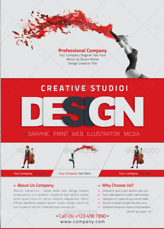
The title in this design and the font used allowed for a some extra creativity. The designer made smart use of the space in between the letters (kerning) while the thickness of the font protected the legibility of the word itself. The image used on the top of the flyer was also colorized, in part greyscale and red.
This is a good example of a course description print ad.
06. The
Like
07. Technical Information Post Card
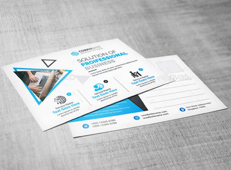
Another simplistic design, with a clean white background, featuring one image and typography, is very easy to the eye. This type puts communication and information to the forefront in importance, with very careful arrangements and use of icons to help with visualization of the headers
08. Bolder Brings More Focus
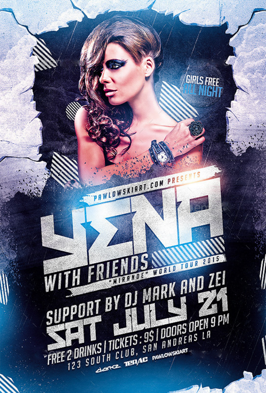
For events and night life promo designs, the best way to go is often adding a touch of extravagance to the flyer. That is to say, extremely large font text, a large icon or image of a guest or main appearance, and a high contrast in color. This concept shows a well balanced use of boldness in the text, a dark but lit background, and an image of a personality that would entice the viewers to want to make it a point to be at the advertised event. Bolder designs are the way to go for club and product launch events.
09. Focus, Focus, Info
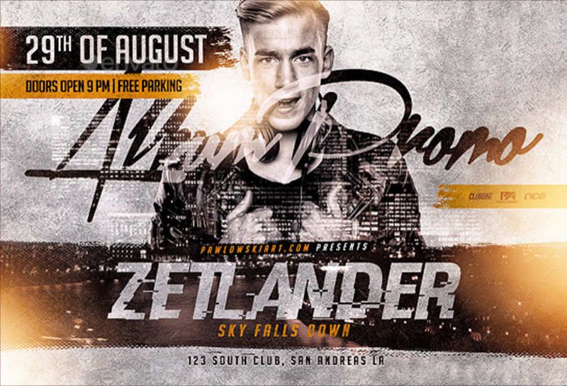
This album promo flyer ad, featuring a picture of the artist, the title of the album and the “album Promo” message in bold, are most recommended for save the date promos and album launch invitations. Sometimes shaped in a square to accommodate the new online social media posting size standard shape, these are most coveted in their raw softcopy formats, to be shared on the internet.
10. Business, Seminar, Big Event
The most appealing aspect of this design to its viewer, is the feeling that not making it to the advertised event would signify missing a big opportunity. This flyer design type, usually printed in larger size, is meant to contain ample information on the seminar, or business meet and greet, including its date and time, expectations, suggestions on that to bring with one, and more. This design features a beautiful mix of font styles and a predominant color blend of teal turquoise and green. Its most compelling aspect is its generosity in space allowed to be used by imagery, even though it is rich with information.

11. Color-Screened for an Edgy Feel
When’s the last time you
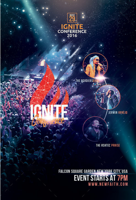
12. Rough Design
Designs that are

13. Composition
Nature-driven concepts often appeal to a sense of

14. Another Composition Concept
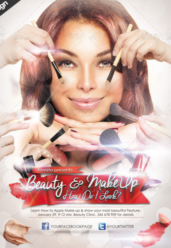
Very simple use of image layers, of a head, hands, and makeup objects at the bottom, is the first part in designing this flyer. The next is the short red banner with the header and subtitle, followed by the key information for the event. This is – as you guessed it, a concept that works nice with artistry flyers, though composition designs can serve almost any other industry purpose.
15. Sales Flyers To Rule Retail
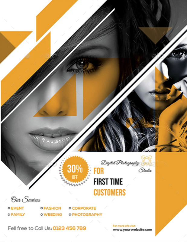
When it comes to retail advertising, you can pull off many different concepts to make your message heard. This one, in the cleanness of space used for a compelling set of images, and a badge icon showing off the discount message for viewers to catch at first when seeing the flyer, this is a perfect simplistic call for sales.
16. Transfers and Geometry
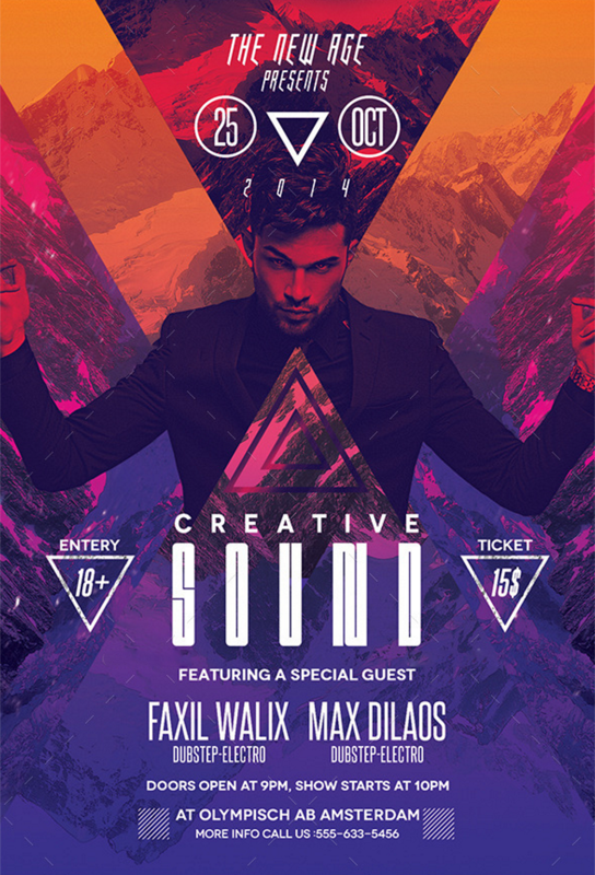
This powerful blend of colors, geometric shapes and a colored screen overlaying the background and picture, instantly make it okay for all the text to be in white. That gives this flyer a look of strong edginess, the type which benefits party, club or art expo events.
17. Bringing in a Sense of Architecture
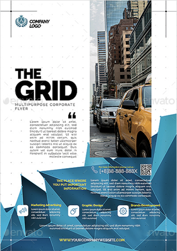
for companies or businesses that want to commend strong respect and a sense of professionalism from its viewers, do get a design that hints at how carefully measured the elements, icons and text are in size, form, color and position, its the best way to go. The simplistic, yet complex aspect of this flyer, the design of which really only shows 3 color tones, not taking in consideration the white space, is telling of the target audience to which it is tailored. This concept benefits any company that needs a message delivered to a more mature, professional crowd.
18. Innovate
If you real
19. Find Balance
It can be

20. Layer Up
Layering different
So what can we take away from all these examples? Let’s take a quick look at a few basics:
- Typography: There are countless font styles out there, but be sure to pick one (or more, but not too many) that suits the purpose and/or theme of your flyer and is sufficiently readable.
- Layout: Pay close attention to things like alignment, spacing, and balance when creating your flyer design. They make the difference between a polished final product and a confusing or cluttered design.
- Color: When you’re having trouble choosing a color scheme, consult a color wheel. Complementary colors (opposites), color temperature (warm or cool), and other art-inspired concepts can help you pick a cohesive color palette. Remember, colors can influence mood and perception, so make sure yours match your flyer’s intent.